© Yomogimochi, GENTOSHA COMICS INC. 2023
LoveLove (also known as Love x Love) is TOKYOPOP’s inclusive romance line. While the titles under this line were formerly published with general TOKYOPOP branding plus an additional ‘button’ graphic with the Love x Love logo, the publisher wished the romance line to have a stronger brand presence in itself and asked me to develop a separate set of branding elements that can be used on the covers of future titles as well as updating the existing logo.
The main challenge of this branding project was to come up with design elements that would not distract attention away from the main illustrations of the book cover while still displaying a recognisable brand presence. To achieve this, the elements needed some level of flexibility – in terms of placement or colours – so that they could be adjusted to each title.


Snow Fairy: © Tomo Serizawa / FRANCE SHOIN
Confessions of a Shy Baker: © Masaomi Ito / HERO'S INC.
I began playing with the concept of ‘stickers’ (See 'Snow Fairy' examples above) as they could be moved around as well as presented in different colours, matching the compostion and mood of each cover illustration. I eventually began trying out the ‘bookmark’ concept (See 'Confessions of a Shy Baker' examples above) that morphed into the final design after a few iterations.
Following the example of TOKYOPOP’s signature ‘brand bar’ element flanking the spines of most of their titles, I also developed a ‘frame’ graphic to be applied to the edges of the cover design to reinforce the visual recognisability of the Love x Love brand. With the nature of the line in mind, the frame was intended to possess a softer and more playful feel than the original TOKYOPOP brand bar.
As for the logo, the TOKYOPOP team wanted a relatively simple update on the existing logo rather than a total makeover. The update process, therefore, began by applying a font that is stylistically similar to the old one with a bit more modern and refined feel. I also tried incorporating the intertwined gender symbols, which had been used along with the logo for Love x Love titles to hint at each book's content, into the new logo. However, it was eventually decided during the development process that we’d drop the gender symbols from the new branding (especially because their books do include additional tags like ‘boys love’ and ‘girls love’ on the back as well) and go for an intertwined hearts shape for a more sleek and renewed look.
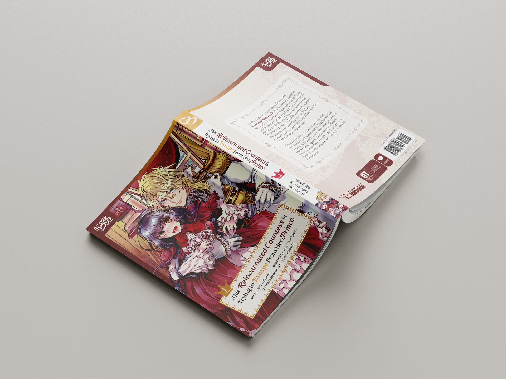
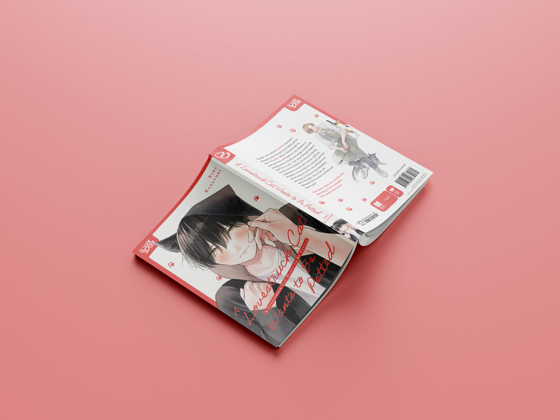
Below are a few examples of how the finalised branding elements can be versatilely applied to different books.


Jealousy Blinds Love: © 2021 Eiji Nagisa / ShuCream Inc.
This Reincarnated Countess Is Trying to Escape From Her Prince: © Akino Shiina, JPUBLISHING Co., Ltd. 2022
A Lovestruck Cat Wants to Be Petted: © 2021 by Nira Kaneyuki / Futabasha Publishers Ltd.


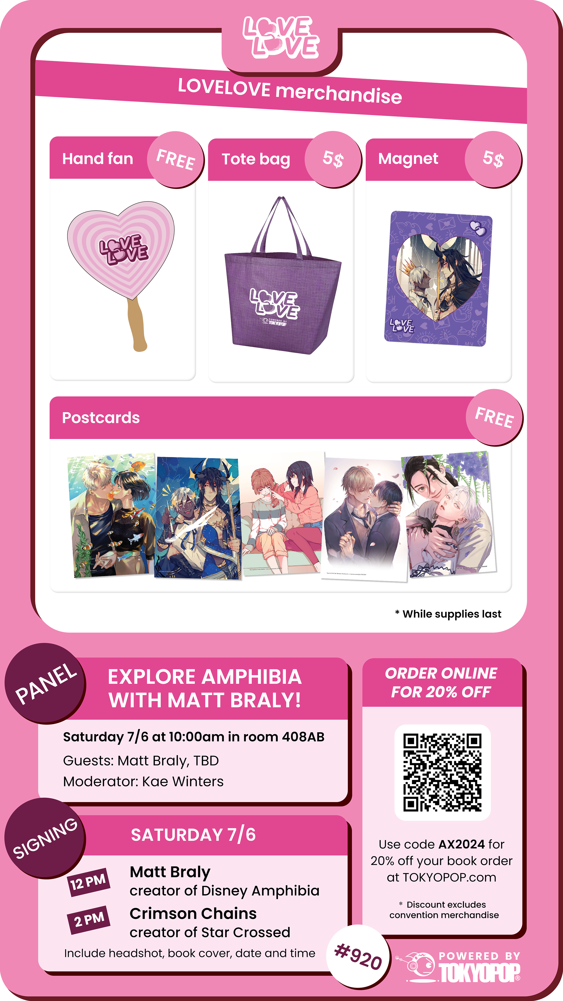
The new LoveLove branding was also implemented in the images for TOKYOPOP's merch & promo display during the 2024 Anime Expo.